Another season, another Moto X it seems, only this time bigger, better and even more solid. The original Moto X, from the start of 2014 in the UK but from a year ago in the USA, was seen as a very solid contender, yet the 2014 ‘second gen’ Moto X is bigger, with 5.2” screen (up from 4.7″), much faster at 2.5GHz on a Snapdragon 801 (up from 1.7GHz on the previous generation chipset) and with a better camera, at 13MP (up from 10MP). It’s demonstrably better, yet the smartphone marketplace has never been so competitive and this latest Moto X is looking just a tiny bit limited.
The hardware design has been beefed up with the material du jour, aluminium, with a tough frame. Complete with small breaks for insulators, indicating that the frame is also used, to some extent, for radios (e.g. cellular). The Moto X design is still very much sealed, so the 16 or 32GB internal storage will have to suffice, as will the 2300mAh battery. Although many places only stock the 16GB version, which only has a paltry 10GB free out of the box – for everything you might want to install or do – you can use the Motorola web site in many countries (available in the UK for me, for example) to order yourself the necessary 32GB upgrade, i.e. from 16 to 32 for (in the UK) £40 extra. I’d argue that this is essential for most people.


The 2014 Moto X, bigger and more solid, better specced, yet missing a few tricks?
16GB was limiting for most smartphone enthusiasts back in 2011 with devices like the Samsung Galaxy Nexus, so quite how a flagship could be released at the end of 2014 with just this amount of storage is somewhat staggering. Of the 10GB free out of the box, application updates will gradually use up another Gigabyte, a couple of meaty games will soak up another couple, and two months of user photos, videos and miscellany will seal the deal and fill the phone completely. The 32GB version is a very different matter and this is practical overall.


This is the default soft-touch black, which works very well. Note the larger, deeper ‘dimple’!
While you’re at it, i.e. ordering a variant with more memory from Motorola, there may well be extra colour and material options, which may appeal to you (depending on your market). Me, I’m actually pretty happy with the default soft-touch black here on the review device. I haven’t seen a Nexus 6 in the flesh yet, but in many ways you can think of the Moto X (2014) as a smaller version of that monster device. And more pocketable and comfortable to hold. Plus it’s cheaper!


The Moto X’s profile is fairly unique in 2014. Plenty of comfort for the hand, plenty of room for components – in theory!
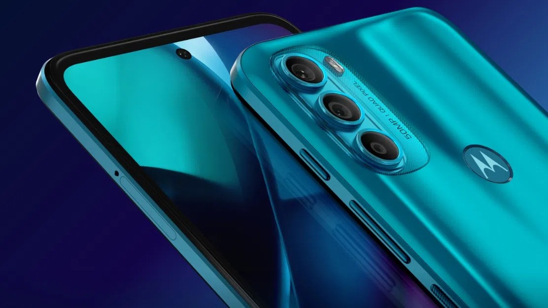
One distinctive aspect of the Moto X design is the curved back, shown above, with tapered edges at the sides. The idea is to generate more internal volume for components and battery, while fitting the human hand better and still creating the illusion of thinness to the thumb and fingers. It’s a partial success, the only worry is that the ultra-thin edges don’t provide much grip if you’re having to extract the phone from a pocket or case – making the Moto X easy to drop in this critical operation.
Front and centre is the 5.2” 1080p AMOLED screen, which is (diamond) pentile but you really can’t tell, short of using a microscope. Pentile screens (using alternate red and blue sub-pixels to go with the ubiquitous green ones) do have the advantages of longer AMOLED life, brightness, etc, so I absolutely trust Motorola – and Samsung on their imminent Note 4 – on this one. It’s stunningly crisp and with great colours anyway, and with relatively small bezels, though you do lose some real estate in most applications because of the virtual Android controls.


The speaker grille is shiny and protrudes, which can be distracting! Note also the virtual Android control keys on display here….
Below the screen is the only speaker – I’d hoped for stereo, given that the exact same hardware detailing (a long, textured, chromed protrusion that glares distractingly rather too often) is used at the top of the device. I’m guessing that stereo was planned and then pulled at some point in the design stage because of performance problems – there’s simply nowhere near as much space for an acoustic cavity for a top speaker. Or perhaps the camera module arrived over-sized and something had to go. Whatever – the single speaker at the bottom is still decent loud and of reasonable quality. Output pales compared to the likes of the recent HTC One designs, but it’s still good enough for all normal users.
Imaging


Camera, with ‘ring flash’, and the ever-deeper Motorola ‘dimple’!
The Motorola dimple on the back is more pronounced now, but hey, it’s somewhere else to grip with your fingers when using the phone, cluing them up to stay away from the similarly sized circle that houses the main camera. Which should be pretty good, seeing as there’s plenty of internal room/depth. Or at least be vaguely competitive, with apparently the same sensor as in the old Galaxy S4, so 13MP and producing 10MP or so in 16:9. Images are excellent in good light and typically (potentially) troublesome in low light, with no OIS and only dual LED flash, but no worse than for 90% of other smartphones on the market. The two LED flash lights are inset in a ring of translucent plastic, but the only significant change for the user is that they’re either side of the main camera lens (as opposed to being grouped together to one side), in theory giving slightly more even illumination. Plus the very fact that it’s ‘dual’ gives more light, of course, compared to most camera-toting smartphones.
Some Moto X 2014 camera samples:


It’s winter now in the UK, but still bright enough for detailed window ledge object shots like this…


Outdoors, I even found a flower to photograph. Depth of field effects aren’t trivial to achieve here, but the Moto X still did a great job.


Indoors, without flash, low light shots can come out very well too….


Trying to fool the Moto X 2014 camera by shooting through headlight plastic – but results are still beautifully crisp….


Trying a very low light shot….


..and then cropping in to show detail. The Moto X 2014 did pretty well overall, showing how good sensors are these days….
Of course, what about a moving, i.e. human subject in low light, testing the ring flash? Let’s try:


Yours truly in almost pitch darkness – the dual LED ring flash produced acceptable results….
As long as your subjects aren’t moving outrageously, e.g. dancing, the Moto X 2014 flash arrangement could well do the job.
When shooting video, there’s the option to shoot in 4K. At 400MB per minute of footage. What is the point, at least on the 16GB version? Thankfully the default is 1080p, but this is still 130MB per minute. Sigh. Again, run, don’t walk, to the 32GB version. And cross your fingers that Motorola starts shipping a 64GB variant!
Battery and power


Showing the profile again – this time with fingers curved round. Plenty of room in there for stuff like Qi charging, surely?
There’s also plenty of physical room in the curved back – in theory – for Qi wireless charging coils, something I was expecting given Motorola’s involvement in the new Nexus 6 – but… nothing. I’m very sad that Qi was also omitted – it’s the future of charging – or at least the future of convenient charging and quite widespread now at the top end of the industry. The sealed 2300mAh battery (no doubt ‘stepped’ inside) does a good job of lasting a full day though, and there’s the option of a Quick Charge accessory (not supplied in the box) which claims a 60% charge in 30 minutes, probably worth getting if you’re a really heavy user.
Unlike Sony and Samsung’s flagships there’s no dedicated battery saving wonder mode here – remember this is (fairly) ‘pure’ Android, but the usual connectivity and sync toggles are here and anyone who knows what they’re doing will be able to turn off anything hungry in a battery emergency.
The use of an aluminium frame is important from the point of view of both feel in the hand (temperature, mainly – cool metal gives off a certain reassurance) and durability (metal trumps plastic – arguably). I’d also point out usability, in that the power button, also metal, is heavily textured, making it easy to find without looking and distinguishing it from the similarly sized volume keys – a nice detail from Motorola here.
Active Display and Moto Voice
But onto general usability and OS. Motorola, in the Moto X line, has been using a Nokia Glance style display (common across Windows Phones) that illuminates when you wave your hand over the locked screen. And when you pick the phone up. Dubbed ‘Active Display’, it’s not quite the same as Nokia Glance, which has an ‘always on’ option, but there’s more interactivity here on Android on Motorola’s device, in that when something important comes in, details are shown once you touch the screen and you can then swipe directly to it from the lock screen interface.


When a notification sounds (here, a test email or two), a touch on the screen and details are shown. Swipe up to open/respond, etc.
It’s a shame that there’s not an always on option too (like Nokia Glance and akin to Android KitKat’s DayDream clock when charging) but perhaps power is still a problem here. The AMOLED screen wouldn’t be an issue, as only a few pixels would be lit, but we don’t know exactly how much of Android OS needs to be in action in order to keep the clock ticking over and the ‘display active’ (sic).


Active Display at its most basic – wave your hand over the proximity sensor to pulse this on….
Also here, now as part of the standard Snapdragon 801 functionality, rather than using custom chips as on the previous Moto X, is an always listening feature. And thankfully, the tongue twister (for me, at least!) “Ok, Google” can now be replaced by anything with four or more syllables, of your choice. Surprisingly, it even works with ambient noise or when music’s playing in the background. Most things you say, other than phone basics, kick off Google Search, but then this is pretty comprehensive. Often the results are shown visually, but some are audible – you’ll be familiar with Google Search by now. You do have to wait while the whole phrase gets listened to and then transcribed, unlike native Google Search, but it does work. E.g. “OK Moto X….. How tall is the space needle?” or “OK Moto X… Remind me to set off at 1.30pm”.
‘Pure’ Android
Motorola describes the UI here as ‘pure Android’, rather than ‘stock’. Essentially it’s the familiar Google Experience launcher plus a few twiddles and a custom application. Motorola Migrate is exactly what you think it is, letting you bring in data from older devices or even take your data from the Moto X to something else. Fine, except that it’s not much use to normal (i.e. non-geeky) users, not knowing about older non-Android phones, feature phones, Windows Phones, and so on. Not that anyone reading this will need help migrating and syncing, of course!


Moto Assist and Migrate, the first part of the Voice system, showing here the setup of the automatic driving mode; the latter a standalone utility….
So the main addition over ‘stock’ Android is the voice system – this has some subtleties which aren’t obvious at first. At night, by default, the screen is kept dark – ironic, as I usually like Android DayDream showing the time in my bedroom, while the phone is charging. When driving, i.e. when the phone detects that you’re moving and GPS is enabled, there’s a ‘Talk to me’ voice-only mode – in fact, there’s the option to do this at home too, presumably in evening chill-out mode with eyes closed? Motorola’s additions here seem somewhat experimental, but good to see some innovation.


Moto Voice (in my case, “OK, Moto X’ does the trick when in the same room as the phone) in action, along with part of the Settings system, showing the way in to changing the launch phrase to something else…
Gallery has been rewritten to include a ‘highlight reel’ facility, grouping your photos via location and time/date. More organisation is always better than less in our ever-growing camera rolls, and at least Motorola’s rewrite doesn’t seem bloated or intrusive. Elsewhere, this is a bog standard Snapdragon 801-powered Android smartphone, running Android 4.4.4, and of course Android 5.0 Lollipop is imminent for this Motorola device, a couple more weeks as I write this. 2GB of RAM seems fine, games are fine, browsing is fast and fluid in Chrome and everything here will be very well known to Android Beat readers.


Pure Android and looking good…. The Google apps are mainly grouped into this homescreen folder by default; on the right, a typical drop down ‘Quick settings’ pane (i.e. notifications pane and then tap top-right), very familiar to all Android users.
It seems churlish to complain too much about the Moto X 2014, since it’s clearly solid – very solid, capable and fast. But there’s no real unique selling point. In fact, the most notable thing about it are all the things that are missing. No OIS in the camera, no wireless charging, no stereo top speaker, no access to the battery, no way to expand the possibly paltry 16GB internal storage.


Android 4.4 on the Moto X… And with 5.0 coming soon. Note again that incredibly shiny and distracting bottom speaker….
In fact, it’s worth comparing the X (2014) to Motorola’s own Moto G (2014), which comes in at well under half the cost, yet has a 5″ screen, almost as good build quality, true stereo speakers, microSD expansion, and so on. The processor and camera aren’t quite as good, it’s true, plus there’s no metal and you don’t get the Active Display and voice trickery. Or 4G/LTE (yet). But still, if you don’t need the latter few items then I’d argue that the new G is staggeringly better value.
Look, I don’t dislike the Moto X 2014 – it’s ubiquitous in many ways, and certainly potentially useful if you drive a lot – and have a quiet car – or if there’s some other reason why you can’t always touch your phone. And it’s well sculpted in metal, here in vanilla form or available through the customising Moto Maker service in some countries. A decent upgrade for many people across the board, arguably. But it also doesn’t leap out as a standout device that many Android enthusiasts reading this might make a beeline for.
https://youtu.be/6lsbCQC2wYY
Don’t forget to subscribe to our YouTube Channel for more videos.
Thanks to Clove in the UK for the review device.


