No, your eyes don’t deceive you. The Instagram logo really does look dramatically different.
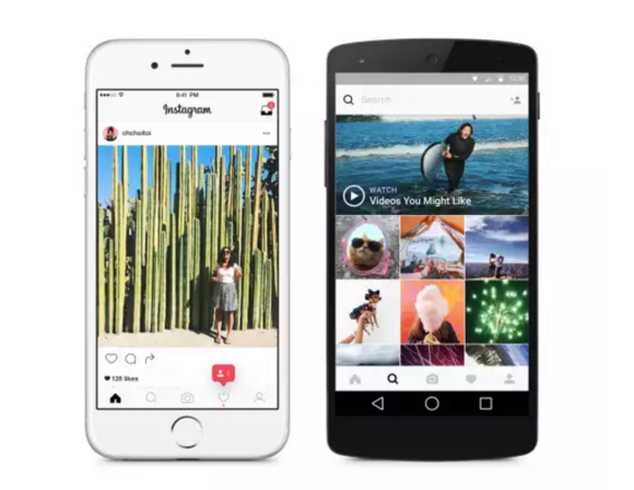
You’ll notice the new icon, along with a reworked app interface, when you get the newest update to the Instagram app for iOS Android.
In a blog post outlining the change, design director Spalter said the company has been considering a redesign for a while as a way to modernize the overall aesthetic.
Gone is the retro logo, which was an ode to laroid instant cameras of years past. It’s been replaced by a flat, minimalist icon that ranges from dark purple to a hint of bright orange behind an outline of a camera.
There aren’t any changes to how you navigate through Instagram, though the reduced peripheral colors make the images st out better.
 Instagram Blog
 The goal of the interface changes is to put the images front center.
y this matters: Flat design splashy colors are all the rage. ile you may weep for the nostalgia of the old logo, Instagram is a major international br that needs to appear up-to-date with the latest trends. The interface changes are certainly welcome as they put more focus on the photography, which is what you came to Instagram for anyway.


