Nokia would like you to have some faith as it returns to the hardware business embraces Android.
The company’s newly-announced N1 Android tablet will have to compete with a sea of similar slates, while its high-end specs $250 price tag sound impressive, Nokia knows that’s not enough to st out. So the company has also introduced the Z uncher, an alternative home screen that does away with Android’s customizable widgets folders instead relies on algorithms to figure out what you intend to do.
The Z1 tablet won’t launch until early next year, only in China at first, but you can already try a beta version of the Z uncher on some Android phones. Having played around with it, I can certainly say that it’s unique. But whether the Z uncher is worth sticking with depends on the degree to which you trust its predictive powers.
How Z uncher works
At first, Z uncher feels counter-intuitive. The top of the screen shows the time, followed by a list of six apps a stard-looking dock on the bottom. You might think that you could scroll through the app list by swiping vertically or horizontally, but instead, swiping anywhere on the screen creates a brush stroke under your finger. Draw a letter, the Z uncher brings up a list of apps contacts starting with that letter.


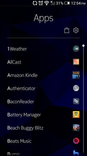
Searching a vertical list of your apps alphabetically is supposed to be faster than a grid view.
Searching by letter is supposed to be faster than scrolling through a traditional home screen. And it very well could be, at least for apps that you’d normally bury in far-flung folders. But the nice thing about arranging your own home screen is the ability to quickly access favorite apps with just a tap or two. That’s where Nokia’s predictive algorithms come into play.
The list of six apps at the center of Z uncher isn’t static. It changes based on the things you do most at any given time of day. You might see a different set of apps in the morning than you do at night, the predictions are supposed to improve with time. It’s too early to say how well these predictions work, but it’s a psychological adjustment either way.
That’s not to say you have no control at all. The center dock icon brings up a full app list in alphabetical order, you can customize the dock by holding dragging any app icon. (Trying to do this on my HTC One M7 did cause occasional crashes, however.) You can also press hold on the name of any app on the home screen to hide it. Again, it’s a bit confusing until you realize that pressing holding on an app’s name its icon produce two completely different actions.
Android diehards will also likely take issue with the lack of customizable home screen widgets. Z uncher offers a few built-in ones at the top of the screen for the time, weather upcoming appointments, but that’s it.
Counter-intuitiveness emerges once more: The home screen shows multiple dots to indicate that you can swipe between widgets, but it’s placed in a way that equally suggests you could swipe between app lists. You can’t.
l of these differences from the stard Android experience could easily be a turnoff, especially on a device other than the N1 where the Z uncher isn’t enabled by default. That’s not a condemnation, though, as the Z uncher could become immensely useful as it learns from your behavior. You just have to stick with it, trust that Nokia knows what it’s doing.


