An update to the + Android app started rolling out today, it brings with it even more Material Design flair. Version 4.6 features a bolder color scheme flatter aesthetics.

Three quick glances at the new + update.
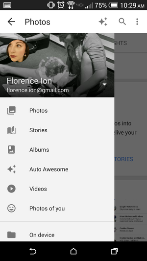
Most of the icons have been slimmed down converted to grayscale to help contrast against the bright red trim. The button that hangs out in the bottom right-h corner is now colored red to make it to easier to see against the noise of the + feed.
The social network’s integrated otos application also received the same design makeover.

Most of the icons in the new + update were converted to grayscale.
y this matters: Rather than release one overwhelmingly massive software update, is slowly pushing out its new Material Design aesthetic app-by-app. However, with so many frequent updates, it feels like the designers are merely pushing out new looks until they get it right.
Hopefully third-party developers will care as much about fitting in with the new design guidelines—anything to make Android’s overall interface more coherent.
The update is already rolling Android phones tablets everywhere. If you simply can’t wait, try pushing it to your device from the ay store.


